Thursday, December 22, 2011

greetings, earthlings!


Happy Holidays!


Maligayang Pasko, Milad Majid, Feliz Navidad, Selamat Hari Natal, Vesele Vanoce, Feliz Natal, Tchestito Rojdestvo Hristovo, Gun Tso Sun Tan'Gung Haw Sun, Kung His Hsin Nien bing Chu Shen Tan, Sreten Bozic, Prejeme Vam Vesele Vanoce a stastny Novy Rok, Glaedelig Jul, Vrolijk Kerstfeest en neen Gelukkig Nieuwjaar, Hyvaa joulua, Joyeux Noel, Frohliche Weihnnachten, Kala Christouyenna, Mele Kalikimaka, Shub Naya Baras, Kellemes Karacsonyi unnepeket, Gledileg Jol, Idah Saidan Wa Sanah Jadidah, Buone Feste Natalizie, Shinnen omedeto. Kurisumasu Omedeto, Sung Tan Chuk Ha, Linksmu Kaledu, Meri Kirihimete, God Jul, Wesolych Swiat Bozego Narodzenia, Sarbatori vesele, Sawadee Pee Mai, Chuc Mung Giang Sinh, สุขสันต์วันคริสต์มาส...and many more languages!


Wednesday, December 21, 2011

gravity, baby!


My third video, in time for the holidays.
Enjoy!


What goes down, must come up! Perceiving the ordinary in a different way.


Friday, November 25, 2011

visual representation


A graphical representation of the coordination of my mind, hand, and mouse pointer's 
online research on visual representation using IO graph.


A graphical representation of me blogging, tweeting, and researching on illustration.


And more searching.

Thursday, November 24, 2011

the enchanted


Illustration from the book, Ang Mahiwagang Kuba (The Enchanted Hunchback)


What was your inspiration for the children's book Ang Mahiwagang Kuba? How did you come up with the characters?

The original version of the story was set in European monarchy. Instead of adhering to the royalty look besides making the illustrations current, I got inspiration from fantasy comics digital artists. The story is very complicated and so are the characters. To challenge myself without illustrating too far, I also made some twists in the identities of each character. Some of them are borrowed from mythologies. Some characters are creature-like that are matched to each other so that the reader will be able to follow them along with the plots. The intriguing character's identities create back stories.

What medium did you use?

The illustrations were traditionally drawn in pencil on a 15x20 board. They were then scanned at a very high resolution image. All of the colorings, enhancements, and retouching were done in Photoshop. Texture was also added digitally.

I noticed the layout and composition seem to have a lot of whitespace and bare details on the setting, does it have any significance?

As the story of Lola Basyang is a classic, I wanted the illustrations to look timeless too. I like the reader to wonder if there's such a place or where can they be. It adds curiosity. Besides, the story is so complicated that I wanted the reader to focus on the characters since there are many protagonists and should fit on limited pages. I placed emphasis by placing more details on the characters rather than the background to make their identities colorful and easier to decipher.

Any significance on the ending illustration?

I ended the story with that illustration as my "postmodern" take on the moral of the story: [edited]. This ending illustration shifts the point of view of the story from fantasy to reality.

What was your intention on the page that looks like a misprint? (the repulsive face of a character distortedly cloned)

It's intended to generate a visually uncomfortable reaction from the reader, relating to the character's annoyed feeling in the story.


The book launch and signing of Ang Mahiwagang Kuba (The Enchanted Hunchback) 
retold by Christine Bellen and illustrated by yours truly, published by Anvil 
together with other Lola Basyang stories of the same author and publisher
will be on November 26, 2011 3p.m. at the Bestsellers, Robinsons Ortigas. 
See you there!


welcome...home?


Welcome Home

The Ang INK: 20 Taon Exhibit at the Ayala Museum is extended until February 26, 2012!

The Ang Ilustrador ng Kabataan (Ang INK, Illustrators for Children) 20 Taon Retrospective exhibit at the Ayala Museum lobby which will be on show from November 22 to January 15, 2012, had me pondering about the practice of illustration:

When illustration becomes independent of the texts, what are the possibilities of its context?

When these illustrations without texts are exhibited and properly curated in a museum, does that transform them automatically to "art"? Or only when placed in the context of art history?

When illustrators are also authors, their personal ideas are expressed through illustration. If personal intentions are validation of what define works of art, is the work of an illustrator-author an art?

While some illustrators does not merely depend on someone else's ideas or story, they also have their own take on an idea, they have personal vision in the expression of an idea. Is the work of an illustrator who interprets another's idea, artless?

A discourse on whether illustration belongs to fine art or commercial design is irrelevant. How come the presence of a silent repudiation from painters, the art scene, and illustrators themselves can still be felt?


how to make children's book illustrations interesting


Illustration from the children's book, Tight Times 


1. Texture is everything. Texture creates a personal connection to the viewer.

2. Misconception: children's book illustration has to look like drawn by kids. Most likely not everyone will appreciate kid-type drawings, children aspire to draw better than they can. It need not always be cartoony (anime/manga) or disney-like (although nothing is wrong with that also) but should always look delightful. Illustration should be easily comprehensible but not too literal, make it open-ended.

3. Lift from quirky but positive childhood experiences.

4. Draw unusual angles or perspectives of a scene.

5. Work on extra details, make up some back, sub stories or subplots not found in the texts.


***

If you like this post, please comment 

Or gift yourself and loved ones with lovely goodies here
I'll appreciate it very much, thank you.

Plus, please check out my youtube videos and sub my channel:


pretty in print


work in progress


rizal's humorous sketches


In the age of digital publishing, I think that any printed matter you create or receive today,
should deserve and evolve into something extra special than merely an ordinary printed story or message. Just like a polaroid print, a handwritten letter, or a typewritten message, the form or packaging should generate tactile and visual sentimentality to the point of keeping the print. Make printed designs collectible. Otherwise, it goes straight to the trash bin and pollute our environment, not to mention wasted human efforts, time, money, and some trees.


Saturday, October 22, 2011

ideas in a bottle


personal work/collection


work in progress for an upcoming major Ang INK exhibition


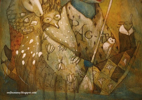
work in progress for a possible book project


I wonder why some people get upset when they find out their work has some similarity to other's work in terms of general or universally known ideas. Similarity in terms of form and rendering - or artistic concept (borrowed term) is another story. As far as I know, ideas can never be copyrighted, but the expression of ideas are. I think there's no such thing as original idea anymore since almost everything has been done by artists. New techniques and media may come, but the same idea has been recycled over and over again: image making. For example, using crown as a symbol for a specific concept like "royalty" and "power" is obviously not groundbreaking anymore and no one can claim they conceived the idea. It is the how and when the concept of crown are visually rendered or executed that makes it refreshing. 

No specific inventor claimed the classical techniques of pencil sketching, stenciling, crosshatching, rubber cut, or perhaps 3D rendering, digital animation etc. Anyone can learn such processes and adapt them into new and exciting applications. Are these ideas of new and exciting application of conventional techniques copyrightable? I don't think so, but their creative output is. 

If a concept calls for "a long wall full of posters", you can have a million creative ways of visualizing artistic concept on paper. By artistic concept, I mean the way you use line, form, color, or texture to create a visual composition. For example, how you see and draw human figures: are they elongated or rounded? tall or skewed? When two artists create similar compositions, the coincidence of thinking the same color, same type of fonts, same location, same wordings, is one in a million. That chance is only either because of mere fate or, simply copying. If the chance occurs repeatedly, then obviously it is not in-good-faith fate.

Is style an artistic concept then? I guess so. If style is a concept, then it is not copyrightable: probably. No one can also claim ownership of a specific style because style is a blurry, often subjective, discussion. It is very difficult to prove who started which and when: the more famous creator of the style often receives the impression or "halo-effect" of being the original, while the unheard-of other creator automatically labelled as copycat, even if this unpopular guy's intentions or work is authentic. This is probably the reason why only the tangible expression of ideas are protected. However, your personal rendition, or your personal vision of perceiving things about life is what transforms old or simple artistic ideas into authentic, sincere, and monumental. 

And if your personal vision is imitated, that's something you should really be concerned about.


Saturday, August 27, 2011

my visual cliche list 2


My visual cliche list 2
(or things I used and will try to avoid drawing)

paper hat
checkered pattern
paper boat, or any boat
a tree in fall/winter
random or pineapple hair
dot eyes
skirt
shorts
sampaguita floral pattern

Puka


If waiting were an adjective, I think it should imbibe tranquility. A pause is a perfect moment to synchronize everything: time, space, character, and matter dance together in peaceful harmony. The thought of randomness and uncertainty scares us but that blur on the horizon makes waiting an exciting journey.


Puka from Sergio Bumatay III on Vimeo.

A hauntingly beautiful weather phenomenon caught on video at the serene beach of puka in boracay island, Philippines. music: Paul Collier's ambient meditation music


To fully appreciate, pause and reflect the wonders of nature.
Watch entirely the HD version at vimeo.
Enjoy!

Friday, August 26, 2011

the sign


Observing town and tourist spot signs in our country left me feeling a little lost. Commercial and political banners or tarpaulins, wires, and pollution clutter historical and scenic views. Some tourist spots are underdeveloped while some are overly developed where establishments spring from every corner of a place. Progress does not always necessarily equate to modern and big buildings. Old and vintage do not always mean unappealing. Our country needs a design overhaul if only young and creative designers push their ideas aggressively and effectively to urban planners. I just feel our country, so diverse and rich in resources, haven't yet maximized its potential.


I remember a personal anecdote where a panel randomly asked me if I were to run the government, how will I improve the economic situation of our country. Being the lover of the arts, I always think of fusing art to any problem-solving ideas, simply replied: "I will hire the best artists, designers, architects, and engineers to make our country extremely beautiful." While I'm very serious with my reply and perhaps it wasn't they expected to hear, I only got a scornful laugh with a side comment, "Yeah, include also beauticians and parloristas to make the ugly fabulous!" Some people don't fully understand yet the importance of design and aesthetics in economic progress. Sad, but true.


***

If you like this post, please comment 

Or gift yourself and loved ones with lovely goodies here
I'll appreciate it very much, thank you.

Plus, please check out my youtube videos and sub my channel:


Thursday, August 4, 2011

Your Heart Today exhibit


"Walang Hanggang Pag-ibig"
pencil and acrylic on canvas
8"x10"

Accompanying words:
“When that final moment does come, let not my loved ones grieve for long. Let them comfort each other. And let them know how much happiness they brought into my life. Let them pray for me, as I will continue to pray for them, hoping that they will always pray for each other." “Let them know that they made possible whatever good I offered to our world. And let them realize that our separation is just for a short while as we prepare for our reunion in eternity.”
(Excerpts taken from the poem Prayer for a Happy Death by Cory Aquino)


August 3, 2011 to September 3, 2011 at the Ortigas Foundation Library
Ortigas corner Meralco Avenue,
Ortigas Center, Pasig City

With works by Ang Ilustrador ng Kabataan and words by Ninoy and Cory Aquino
Please come and visit!


***
If you like this post, please comment

Or gift yourself and loved ones with lovely goodies here
I'll appreciate it very much, thank you.

Plus, please check out my youtube videos and sub my channel:


Thursday, July 21, 2011

finding inner wealth


“Remember that wherever your heart is, there you will find your treasure. You’ve got to find the treasure, so that everything you have learned along the way can make sense."
- from The Alchemist

Wednesday, July 13, 2011

the virtourist


Wat Arun in Bangkok, Thailand

View more of the 3D collection of the virtourist here.


Tuesday, July 12, 2011

baby send offs


works in progress for an upcoming Ang INK group exhibit


I have this separation anxiety whenever my babies are "adopted" to a new home. I wonder how fellow artists cope up with sending off their works.


Friday, June 24, 2011

Post-it Affirmation Art no. 7


"Shift from the competitive to creative mind."

Friday, June 17, 2011

Rizal's turf


progress?

fly

behind you

pillars

flag ceremony

In celebration of the 150th Anniversary of Rizal's birth.


You are free to use these photos, provided that you don't sell them. Kindly place proper credit or link to my blog.
Click on the photos for high resolution files.

Tuesday, June 14, 2011

Post-it Affirmation Art no. 6


"Move on. Look forward. Never look back."

Monday, June 13, 2011

Why I love the Peacock


If there's one local children's book I am most influenced by, in terms of illustrative vision, it's The Crane and the Peacock. The book is one of the series of Aesop's fables retold by Boots S.A. Pastor and illustrated by Jason Moss. Published by Lampara in 2003, the series is already out of print. You are probably one of the very fortunate ones if the books are already in your collection. I thought this book and series deserve a recognition, in honor of its groundbreaking feat to local children's book illustration.

The illustrations are so avant-garde and stylish, makes you think and feel it was made for an intelligent audience. The illustrator exploited every medium, technique, and style to create his rendition of Aesop's playful world. No matter how spectacular the illustrations were, it's unfortunate that such breakthrough was gone unnoticed by local readers.

I particularly liked The Crane and the Peacock simply because the visual narrative is not literal. Who would have thought of illustrating a story with animal characters to be portrayed by humans don in animal suits? A metaphor within a metaphor within a metaphor. That illustrative vision was way ahead of its time when local children's book illustration was all still about cuteness, regionalism, and colonialism.

If you are lucky to find copies in bookstores somewhere, grab this treasure. And if you're lucky enough, have your collector's item signed by the artist.


***

If you like this post, please comment 

Or gift yourself and loved ones with lovely goodies here
I'll appreciate it very much, thank you.

Plus, please check out my youtube videos and sub my channel:


Sunday, June 12, 2011

Why I love Papa and Mama's House


When words can't describe how one feels, pictures can. This is how I perceive the illustrations for Papa's House, Mama's House, a children's book written by Jeanette Patindol and illustrated by Mark Salvatus III. The book won both the grand prize in the Philippine Board on Books for Young People Alcala and Salanga Prize. While published in 2004 by Adarna House, the illustrations and theme are still so current.

The story is about a child's confusion about her parent's emotionally difficult situation. The theme is a radical development in local children's literature where such topics weren't usually discussed appropriately to young minds. The story was well written to adapt a child's comprehension.

The illustrations have bold strokes of provocative colors with small sketchy figures. The heavy painterly style and scratch techniques work both ways: it may either suggest the deep unsettling feelings of the character perfectly expressed through colors and strokes, or the style symbolizes the love of parents for the character which doesn't diminish despite their situation. While looking at the illustrations, you can actually feel those emotions as you read. The small figures may connote that we play deaf in children's honest and pure voices about issues and they should also matter in adult decisions, no matter how young they are. How often do we disregard or underestimate a child's understanding?

The illustrations of Papa's House, Mama's House is a good example of how style may expressively convey emotions.


***

If you like this post, please comment

Or gift yourself and loved ones with lovely goodies here
I'll appreciate it very much, thank you.

Plus, please check out my youtube videos and sub my channel: